
Forecasting the near future in design is a reflection of society’s concerns. At one time, keeping up with trends meant reading a monthly journal. Consumers who are not participating are growing ever more anxious about the specter of being technically eclipsed.
This chasm is revealed in the decisions made daily by brand designers. More and more identity design is trying to find a way to span the gap or choose a side. Though it is losing its grip, it is not going away: Clichés work because they are clichés.
Smaller companies are not afraid to adopt a logo that shows them at the size they are. Ebay, USA Today, Windows and many more over the last year have adopted wordmarks and logos that eschew styles with shorter expiration dates.
Increasingly, consumers have become comfortable in their role as contributors and not just spectators. Personal logos and monograms have reached epidemic proportions. Those satellite areas of exploration that haven’t bloomed into trends yet will either be tremendously successful or tragic failures. (Look to next year’s trend report for the results.) In the meantime, there are always those unexplained clusters of visual flotsam that must be mentioned in the “quit it” column: There are too many octopuses, snakes, elephants, peacocks, kangaroos, weathervanes, wheat stalks or heads, and anchors to count.
Now we come to the comments that are a mandatory opening to each year’s Trend Report—but they are worth repeating. At this writing, we have just over 204,000 logos on the LogoLounge site, submitted from designers in more than 100 countries worldwide. For this report, we examined more than 20,000 marks.
When you cull through and organize this many logos, trends are observed. It’s our hopes that you will use these observations, together with your own wit and perception, to advance the field of logo design to the next level of brilliance.
This year we present you with the fifteen leading logo trends.
Here trend logo examples
The iconic map pin has given way to the ubiquitous digital version of itself. Society navigates with GPS, and it marks its destinations with an iconic inverted drop shape that nods an homage to its predecessor. In logo design, place often is an important part of a story, and this malleable symbol is finding itself merged and modified to convey an even deeper message. It’s not every day that designers are presented with a virgin icon fresh for appropriation but here it is.
Crossed

Crossed trend logo examples
It’s been less than a handful of years since designers went on a binge with circles containing crossed anything, from arrows to lines to sticks. The standard solution usually involved a graphic being placed in each of the four quadrants formed by these items—a client’s initials, a foundation date, a name, a crown, a simple icon or symbol of some kind. The first few had a nice feel to them, but the proliferation of this kind of mark turned most of them into the punch line of their own joke.
The dust has cleared, and the frenetic pace of this design’s creation has slowed to a trickle. It’s a technique that lifts the regal nature of the client it represents and implies a certain sophistication even if it’s a pair of crossed plungers.
Wave

Wave trend logo examples
Subtlety plays an important role in this group, and it may well take a second look to see the connections. Rather, it is gentle and certainly under control.
Given time, these marks look as if they should come to rest, but the viewer’s better judgment suggests that the rolling nature of these icons is ongoing, like the tides. These appear to have a liquid quality to them, but as a logo design, it demonstrates an entity’s ability to contain a volatile substance and control the results.
Molecules

Molecules trend logo examples
Think exacting and with specific purpose. Though these identities may not represent a research lab or petrochemical endeavor, they do express the understanding on the client’s part for methodology.
The very geometric nature of these marks lets the consumer know that process is critical to success. The circles connected by lines can represent the aspects of a large business that works together in harmony, or many coming together to create a greater whole. This is how subjective designers present objective solutions to clients that demand a proof of outcome.
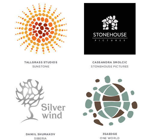
Nature Marks

Nature Marks trend logo examples
Long before DNA, we knew that nature’s manifestation of individualism existed everywhere. These patterns are immediately recognized for what they are even though each holds a clue to the originality of the entity.
Combining these thumbprints of nature as a surface treatment on a mark is seen as a way to address the unique and peculiar aspects of a client. The print of every individual, regardless of wealth, religion, race, education, sex, or any other divisor, looks pretty much the same, but at the same time, each is unique—an imprimatur from Mother Nature.
Membrane
Membrane trend logo examples
Pattern is no stranger to the world of logo design. The logos in this group are starting to use an irregular pattern that appears to be much more organic in nature. These marks demonstrate order and harmony drawn from dissonance and an appreciation of the beauty of differences brought together for a common good.
Formula

Formula trend logo examples
This, and this, and this, when brought together equals something much greater.
These logos appear in a variety of styles, and whether the formula is displayed vertically or horizontally, there is usually a sequence to be followed for the result. Another connotation derived from this category is simplicity, as if there is someone telling the consumer, “It’s not that hard to understand.” Breaking a process into steps or showing its transparency is a good method of engaging the consumer with an educational message that coincidentally is also used to identify.
Bracketing

Bracketing trend logo examples
As different as these marks appear, a square in a negative white space is the connecting tissue. Generally, two elements of equal construction are pushed together to create a square- or diamond-shaped center which becomes the unwitting centerpiece of the logo. It’s a bit like two brackets that are uniquely designed and certainly have a message, but it’s never as much about the device as what is between them.
Here, two pieces make a whole and create something greater in the central area. The beauty of showing potential is that the consumer is able to dream and fill in the blank with the answer that best serves his objective.
Eyelet

Eyelet trend logo examples
Imagine a world where you are not allowed to make any hard right turns, and you pretty much have the concept that leads to this genre of marks. Were you given enough rope, you could no doubt design your logo with it. These marks are approachable, friendly, and demonstrate a methodology by tracing a path from beginning to end.
Slash

Slash trend logo examples
The ubiquitous slash comes of age and has found a home in the realm of identity design. It also is at home as a divider between initials such as b/w for black and white, or as a divider in a fraction, or even as the mark for a spare at your local bowling lane.
In identity design, it is a clean visual substitute that allows us to connect or build separation between concepts or entities. The mark appears equally comfortable in a typographic solution or maybe used with a bit more wit between icons/visual elements or both. Because of the almost invisible nature of the slash, it has much more utility and probably will be viewed much more like an ampersand or another letter in our alpha-arsenal.
Written

Written trend logo examples
As this trend developed this year, it started as a recognition of the abundance of logos incorporating handwriting. Most of these looked as if a blackboard had been created in the shape of a “fill in the blank” for whatever the topic was.
Folks have been building type into shapes for years, and though that is a modest part of this trend, the overarching majority of these look like a barista at Starbucks has been busy designing logos when not filling out the menu boards at the store. The handmade aspect of these solutions brings to the story a sense of care and attention to detail missing from the competitor’s soulless entity.
Line Craft
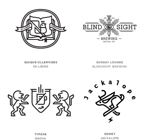
Line Craft trend logo examples
Probably most evident of any trend this year is the aesthetic and beauty associated with these marks and their understated elegance. The crafting of logos using a single stroke weight is not new, but it is in full display with nuances that keep the work fresh. The illustration and the typography are both handled with even weights, which allows the copy to have a true sense of place.
Influences may come from icon systems that have been developed over the last several years using a non-scalable line weight to build consistency. A nod to the work of the ‘50s is also evident here, which is always a pleaser for generations still in love with that era.
Badges

Badges trend logo examples
A glance at this year’s logo crop turns up more crimped edges than a state fair pie contest. Badge logos are doing their best bottle cap impression with slow, wavy edges; Some of these are intended to be seal-like, and then others just use the shape as an enclosure.
There is an air of official-ese associated with these marks but also a wink that they can just as easily be irreverent and light-hearted. Dating back to the irregular edge created by an impression in a wax seal, this shape over the years found regularity in shape. Reminiscent of the gold seal applied to any document of importance, the shape still denotes an official stamp of approval, and designers are glad to promote this school of thought.
Banners

Banners trend logo examples
As a graphic device, the banner has enjoyed a significant ride with designers for a number of years. What was once a nice way to add a violator to a package or a website has this year found a place at the logo design table. Because of the nature of the product this emulates, it allows a designer to build depth and layers into an otherwise flat solution.
Monograms

monograms trend logo examples
The art of personal aggrandizement is alive and well, and designers are busy doing their part to keep it fresh. These solutions range from overly ornate to incredibly spartan in appearance and have been the outgrowth of the desire for everyone to have a mark of their own.
When there is little else to say about an individual, you can always bank on him having at least two initials you can rub together to create a monogram. Considering the enormous trade in counterfeit fashion apparel and accessories, it helps prove the dollar value a logo can infuse in an industry.
Tag Article : deloitte graphic designer,famous business logos,logo for accounting firm,logo for accounting firm,construction company logos,squarespace logo maker
 Reviewed by Ismail Fahmi
on
July 25, 2020
Rating:
Reviewed by Ismail Fahmi
on
July 25, 2020
Rating:


No comments:
Post a Comment